
Series: The Practical Guide to Dimensionality Reduction
Part 3 of 4
t-SNE and UMAP: When Linear Methods Aren't Enough
By Cory Henn · March 2026 · No linear algebra required
In Part 2, we covered PCA - the workhorse of dimensionality reduction. It's fast, interpretable, and it finds the axes of greatest variation in your data. But we ended on its biggest limitation: PCA only sees straight lines. Biology doesn't work in straight lines.
Cell differentiation bends. Activation states form gradients that curve through gene expression space. A T cell moving from naive to effector to exhausted doesn't travel in a single direction, it follows a trajectory that twists and branches. PCA flattens all of that into a linear projection, and the result is often a blobby mess where real structure gets lost.
That's where t-SNE and UMAP come in. They're built to find exactly the kind of curved, branching, nonlinear structure that PCA misses.
The neighborhood principle
Both t-SNE and UMAP work on the same core idea, and it's surprisingly intuitive.
Forget about preserving global distances or finding axes of variation. Instead, think about neighborhoods. For every cell in your dataset, these methods ask: who are this cell's closest neighbors in the original high-dimensional space? Then they try to arrange all the cells on a 2D plot so that those neighborhood relationships are preserved as faithfully as possible.
Think of it like seating a wedding reception. You have 200 guests. In the “real world” (high-dimensional space), you know who's close to whom - family clusters, friend groups, work colleagues. Your job is to arrange tables in a room (2D space) so that people who are close in real life end up sitting near each other. You can't perfectly preserve every relationship, the room is smaller than reality, but you can make sure that tight-knit groups stay together.
That's what these methods do. Cells that are similar across thousands of genes end up near each other on the plot. Cells that are different end up far apart. And because the algorithm doesn't insist on straight-line axes, it can capture curves, branches, and clusters of any shape.
t-SNE vs. UMAP: the practical differences
Both methods use the neighborhood principle, but they differ in ways that matter for your analysis.
t-SNE was the standard for years. It produces beautiful, well-separated clusters and has a distinctive look, tight islands with clear gaps between them. But it has real drawbacks. It's slow on large datasets. It doesn't preserve global structure well, meaning the relative positions of clusters on the plot are essentially arbitrary. Two clusters being close together on a t-SNE doesn't mean those cell types are biologically related. And running t-SNE twice on the same data with different random seeds can give you plots that look completely different.
UMAP has largely replaced t-SNE in most single-cell workflows, and for good reason. It's faster, it scales better to large datasets, and it does a better job preserving global structure, meaning that if two clusters are near each other on a UMAP, there's some reason to think those populations are related (though you should still verify this biologically). UMAP also tends to preserve continuous trajectories better, which matters if you're studying differentiation or activation states.
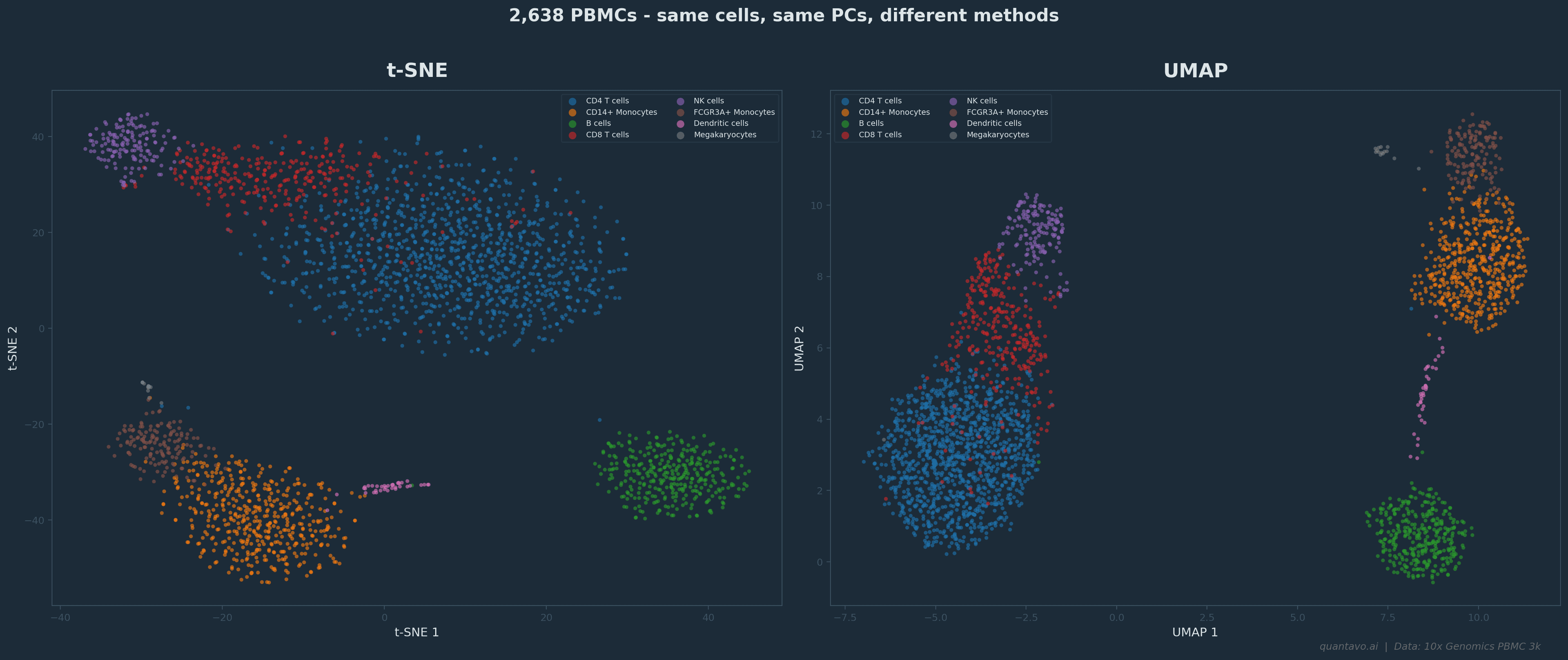
2,638 PBMCs from the 10x Genomics PBMC 3k dataset. Same cells, same top 30 PCs, different methods. t-SNE (left) produces tight, well-separated clusters but relative positions between clusters are arbitrary. UMAP (right) preserves more global structure — nearby clusters tend to be biologically related.
That said, neither method is “right.” They're both lossy compressions of a vastly higher-dimensional reality. The question isn't which one is correct, it's which one is more useful for what you're trying to see.
The three things most people get wrong
Here's where the practical advice comes in. I see these mistakes constantly, and they're all avoidable.
Mistake 1: Interpreting distances on the plot as quantitative. A gap between two clusters on a UMAP does not mean “these cell types are very different.” A tight cluster does not mean “these cells are very similar.” The 2D layout is optimized for preserving neighborhoods, not distances. If you need to quantify how different two populations are, go back to the PCA space or compute distances in the original high-dimensional data. Never measure biology with a ruler on a UMAP.
Mistake 2: Ignoring the parameters. Both methods have parameters that dramatically change the output. For UMAP, the two most important are n_neighbors and min_dist. A low n_neighbors (like 5) emphasizes very local structure — you'll see tight, fragmented clusters. A high value (like 50) smooths things out and emphasizes broader patterns. For t-SNE, the equivalent is perplexity, which controls a similar local-vs-global tradeoff. The defaults are usually reasonable, but if your plot looks wrong, too fragmented, too blobby, clusters merged that shouldn't be, the first thing to try is adjusting these parameters.
Mistake 3: Running UMAP on raw data instead of PCA-reduced data. This connects directly to Part 2. In a standard scRNA-seq pipeline, UMAP doesn't operate on 20,000 genes. It operates on the top principal components, usually somewhere between 10 and 50 PCs. This means your PCA decisions (how many PCs, which genes) directly shape your UMAP. I've seen cases where a messy, uninterpretable UMAP was “fixed” entirely by changing the number of PCs fed into it. If your UMAP looks wrong, check your PCA first.
When to use which
Here's a simple framework:
Use PCA when you want interpretable axes, when you need to identify which genes drive variation, or as the preprocessing step before t-SNE/UMAP. PCA is also your best option for batch effect detection — batch effects often show up cleanly on PC1 or PC2.
Use UMAP as your default visualization for single-cell data. It handles large datasets well, preserves both local and global structure reasonably, and is the current community standard. Most reviewers expect it.
Use t-SNE when you're specifically interested in very fine-grained local structure, or when you're working with a smaller dataset (under ~10,000 cells) where its slower speed doesn't matter. Some people still prefer the visual clarity of t-SNE's tighter clusters, and that's a valid aesthetic choice.
Use both when you're being rigorous. If a biological conclusion changes depending on whether you visualize with t-SNE or UMAP, that conclusion probably isn't robust.
The One-Paragraph Summary
Every dimensionality reduction plot is a cartoon of your data. A useful cartoon — one that reveals real structure and helps you generate hypotheses. But still a cartoon. The real data lives in 20,000 dimensions. The plot lives in two. Something is always lost in translation. The best analysts treat these plots as starting points for investigation, not as evidence. They see an interesting cluster on a UMAP and then go back to the data to verify it — checking marker genes, running statistical tests, looking at the cells in the original high-dimensional space. The plot tells you where to look. The data tells you what's real.
Up Next: Part 4
Choosing the Right Method for Your Data — a practical decision framework for picking between PCA, t-SNE, and UMAP based on your data type, dataset size, and what question you're actually trying to answer. Read Part 4 →
I'm Cory Henn, an immunologist and data scientist who helps biotech teams and academic PIs make sense of complex biological data. If you have a dataset that needs answers, I offer free 30-minute discovery calls.
Book a free 30-minute call and we will figure out the best path forward for your data.
Book a Free 30-Minute Call