
Series: The Practical Guide to Dimensionality Reduction
Part 2 of 4
PCA: Finding the Best Camera Angle for Your Data
By Cory Henn · March 2026 · No linear algebra required
In Part 1, we established the problem: your data has too many dimensions, most of them are noise, and you need a way to compress it down to something you can actually work with.
PCA (principal component analysis) is the most common way to do that. It's also the method most people use without really understanding. You run RunPCA() in Seurat, pick some number of components, and move on to clustering. It works. But understanding what PCA is actually doing will change how you interpret your results and catch problems you'd otherwise miss.
So let's build the intuition.
The camera angle analogy
Imagine you're standing in a room full of people at a party. Everyone is spread out: some by the bar, some on the dance floor, some near the door. You want to take a single photograph that captures the most information about how people are arranged in the room.
If you take the photo from directly above (a bird's-eye view), you might see the clusters clearly. The bar crowd, the dancers, the wallflowers. Great angle.
But if you take the photo from the wrong angle (say, from floor level, looking across the room edge-on), everyone overlaps into a single blurry line. Same room, same people, terrible perspective. You've lost the structure.
PCA finds the bird's-eye view.
More precisely, PCA looks at all the variation in your data across all 20,000 genes and asks: if I had to pick one axis, one direction through this 20,000-dimensional space, that captures the most spread between my cells, what would it be? That's your first principal component, PC1. It's the single best camera angle.
Then it asks: given that first axis, what's the next best direction, perpendicular to the first, that captures the most remaining variation? That's PC2. And so on, for as many components as you want.
The result is a new coordinate system, rotated and ranked by how much variation each axis captures. The first few PCs contain the biggest biological signals. The last ones are mostly noise. And now, instead of plotting cells across 20,000 genes, you can plot them across 2 or 3 PCs and actually see structure.
What “variance explained” actually means
When you run PCA, you'll get a number for each component: the percentage of total variance it explains. PC1 might explain 15%, PC2 might explain 8%, and so on, with each subsequent PC explaining less.
Here's the intuition: if PC1 explains 15% of the variance, that means 15% of all the differences between your cells can be captured by a single axis. That's a lot of information compressed into one dimension. By the time you've included PC1 through PC10, you might be capturing 60–70% of the total variation in your dataset, with just 10 dimensions instead of 20,000.
The rest? Mostly noise, technical artifacts, and gene-level variation that doesn't help you distinguish cell types.
This is why the elbow plot matters. It shows you the variance explained by each PC in descending order. You're looking for the point where the curve flattens, where adding another PC stops giving you meaningful new information. Everything to the left of the elbow is signal. Everything to the right is mostly noise you don't want feeding into your clustering.
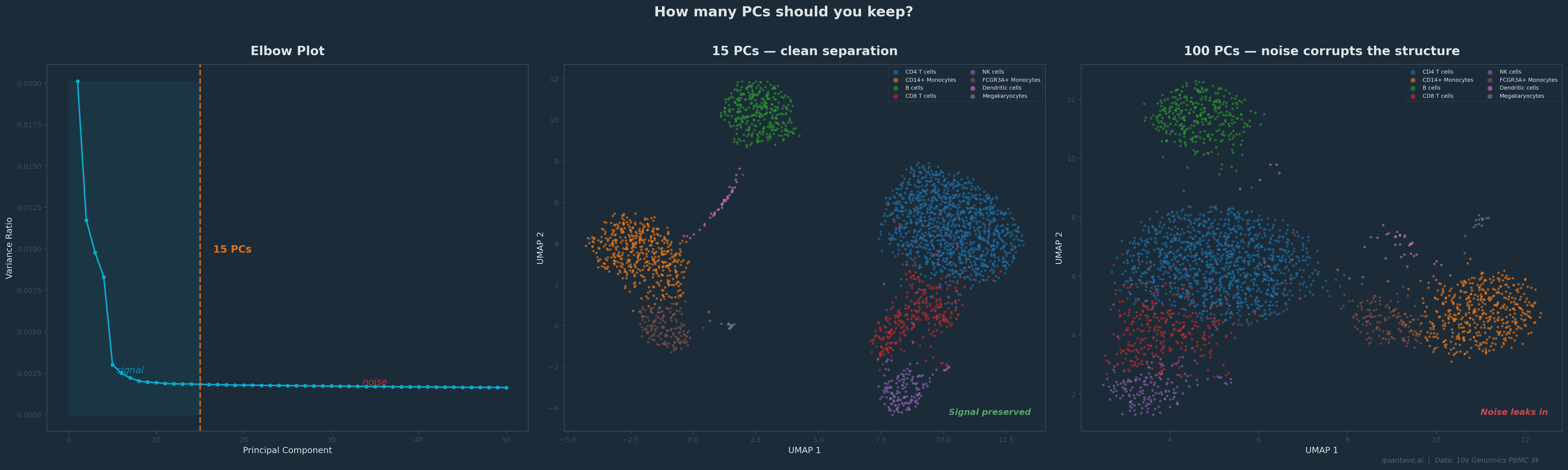
10x Genomics PBMC 3k dataset. The elbow falls around 15 PCs. Using 15 (center) gives clean cluster separation; using 100 (right) lets noise bleed into the embedding and blurs the structure. Same cells, same clustering algorithm, different PC cutoff.
The decisions that actually matter
Here's where PCA becomes practical. When you run a standard scRNA-seq pipeline, there are a few PCA-related decisions that directly affect your downstream results.
How many PCs to keep. This is the single most consequential PCA decision you'll make. Too few and you lose real biological signal: rare cell types might vanish. Too many and you're pumping noise into your clustering and UMAP. The default in Seurat is often 10–30, but the right answer depends on your data. Use the elbow plot. Use the JackStraw test if you want a statistical answer. And if you're unsure, try running your clustering with 15 PCs and then with 30 and see if the results change meaningfully. If they don't, it doesn't matter much. If they do, you need to think harder about which is right.
What genes you start with. PCA operates on whatever genes you give it. In most scRNA-seq workflows, you first select highly variable genes: the 2,000–5,000 genes that vary the most across cells. This is important. If you run PCA on all 20,000 genes, the signal gets diluted by thousands of non-informative genes. If you pick too few, you might miss important variation. The default of 2,000 works surprisingly well for most datasets, but it's worth knowing that this choice exists and that it shapes everything downstream.
Scaling matters. PCA is sensitive to the magnitude of your data. A gene expressed at counts in the thousands will dominate the PCs over a gene expressed in the tens, regardless of biological importance. That's why standard workflows normalize and scale the data before PCA, so that every gene gets an equal vote. If you skip this step, your first PC will just reflect which genes happen to have the highest raw counts.
When PCA isn't enough
PCA is powerful, but it has a fundamental limitation: it only finds linear structure. It looks for straight-line axes through your data.
Biological data is rarely that polite. Cell differentiation trajectories are curved. Immune cell states exist on spectrums that loop and branch. T cell activation doesn't move in a straight line through gene expression space; it bends.
This is why PCA plots of scRNA-seq data often look like blurry clouds with no clear separation, even when the data has real structure. The structure is there; it's just nonlinear, and PCA can't see it.
That's where t-SNE and UMAP come in. They can find curved, folded, and branching structures that PCA misses entirely. I'll cover both in Part 3.
But here's the critical thing: t-SNE and UMAP both start from PCA. In a standard pipeline, you first reduce from 20,000 genes to the top PCs, and then UMAP operates on those PCs, not the raw data. So even if your final visualization is a UMAP, the PCA step still shapes everything you see. Getting it right matters.
The One-Paragraph Summary
PCA finds the axes through your high-dimensional data that capture the most variation, ranked from most to least informative. You keep the top ones (the signal) and discard the rest (the noise). It's the backbone of almost every single-cell analysis pipeline, not because it's perfect, but because it's fast, well-understood, and gives downstream tools like UMAP a cleaner starting point. The decisions that matter most are how many PCs to keep and what genes you run it on. Everything else follows from there.
Coming Up in Part 3
t-SNE and UMAP: when linear methods aren't enough. I'll explain why UMAP starts from PCA output (not raw data), how parameters shape what you see, and what you can and cannot interpret from the final plot.
I'm Cory Henn, an immunologist and data scientist who helps biotech teams and academic PIs make sense of complex biological data. If you have a dataset that needs answers, I offer free 30-minute discovery calls.
Book a free 30-minute call and we will figure out the best path forward for your data.
Book a Free 30-Minute Call