
Series: The Practical Guide to Dimensionality Reduction
Part 1 of 4
Why Your Data Has Too Many Dimensions (And Why That's a Problem)
By Cory Henn · March 2026 · No linear algebra required
Let me start with something that might sound obvious but has real consequences for your analysis:
You cannot visualize 20,000 genes at the same time.
If you've run a single-cell RNA-seq experiment, every cell in your dataset is described by the expression levels of roughly 20,000 genes. Each gene is a dimension. That means every cell is a point floating in 20,000-dimensional space.
Your brain tops out at three.
This isn't just an inconvenience. It's a fundamental problem that affects every step of your analysis, from quality control to clustering to the figures you put in your paper. Dimensionality reduction is how we solve it. But before we talk about the tools (PCA, UMAP, t-SNE, all coming in later posts), it's worth understanding why high-dimensional data is so unintuitive, and what actually goes wrong when you have too many dimensions.
The curse isn't just a catchy name
There's a concept in statistics called the “curse of dimensionality.” It sounds dramatic, but it describes something simple and concrete.
Imagine you're measuring one thing about a group of cells: expression of CD4. You could line those cells up on a number line and immediately see which ones express it highly and which don't. Easy. One dimension, no problem.
Now measure two things: CD4 and CD8. You've got a scatter plot. Still intuitive. You can see your T cell populations separating.
Three things? You can make a 3D plot, but it's already getting harder to interpret. You're rotating it around, squinting at it, trying to decide whether that cluster in the back is real.
Now jump to 20,000 measurements per cell.
Here's what goes wrong: in high-dimensional space, everything is far apart from everything else. The distances between your nearest neighbor and your farthest neighbor start to converge. The concept of “close” breaks down. Clustering algorithms struggle because the signal-to-noise ratio collapses. The meaningful biological differences between cell types get drowned out by thousands of genes that are just adding noise.
Think of it this way. If I gave you directions to a coffee shop using one landmark (“turn left at the church”), you'd find it. If I gave you directions using 20,000 landmarks, most of which are irrelevant (“pass the third fire hydrant, ignore the crack in the sidewalk, note the color of the fourth mailbox...”), you'd never get there. More information isn't always better. Sometimes it's just more noise.
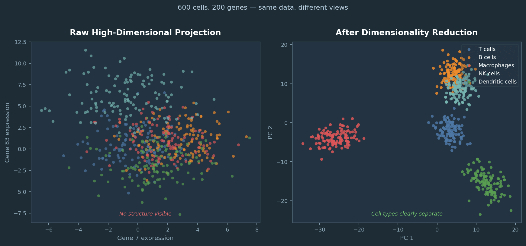
Same 600 simulated cells, same 200 genes. Left: projecting two arbitrary genes from the raw matrix reveals nothing. Right: after selecting high-variance genes and applying PCA, five cell types separate cleanly. Dimensionality reduction is not cosmetic; it changes what you can see.
Most of your genes aren't helping
Here's the practical reality of biological data: out of 20,000 genes measured in a typical scRNA-seq experiment, only a fraction are actually varying meaningfully between your cells. Many genes aren't expressed at all. Many others are expressed at roughly the same level everywhere, housekeeping genes doing their thing. And a good chunk are just contributing technical noise.
The genes that actually help you distinguish a T cell from a macrophage from a fibroblast? That might be a few hundred. Maybe a couple thousand, depending on the complexity of your system.
Dimensionality reduction is essentially asking: what if we only paid attention to the dimensions that matter?
Not by manually picking genes. That introduces bias and doesn't scale. But by finding mathematical summaries that capture the major patterns of variation across all 20,000 genes and compress them into a manageable number of dimensions. Ideally two or three, so you can actually look at a plot and see structure.
This is not optional
If you're working with single-cell data, you're already using dimensionality reduction whether you think about it or not. Every UMAP plot is a dimensionality reduction. Every time Seurat runs FindNeighbors(), it's operating in a reduced-dimensional space (the top principal components, by default). Your clustering results depend directly on how that reduction was done and how many dimensions you kept.
The same is true for flow cytometry. If you're using viSNE, PHATE, or any embedding tool to visualize a 20-parameter panel, you're reducing dimensions. The choice of method, the parameters you set, and the preprocessing decisions you make before the reduction all shape what you see and what you miss.
This is why every biologist working with high-dimensional data should have an intuition for what these methods actually do. Not the linear algebra. The intuition. What are you keeping, what are you throwing away, and what can go wrong?
Coming Up in Part 2
I'll break down PCA, the most fundamental dimensionality reduction method and the one that underlies almost everything else in a typical analysis pipeline. I'll explain it without eigenvectors, using an analogy that actually makes sense. We'll cover what it does, how to interpret it, and the practical decisions you need to make when using it on real biological data.
I'm Cory Henn, an immunologist and data scientist who helps biotech teams and academic PIs make sense of complex biological data. If you have a dataset that needs answers, I offer free 30-minute discovery calls.
Book a free 30-minute call and we will figure out the best path forward for your data.
Book a Free 30-Minute Call